
How to Take Better Travel Photos (Without Carrying a Camera)
The place felt remarkable and the photo looks like a postcard. Here's what actually makes travel photos work: timing, scale, foreground, and details over landmarks.
How to Take Better Travel Photos (Without Carrying a Camera)
Travel photos have a particular way of disappointing. The place felt remarkable and the photo looks like a postcard rack. The problem usually isn't the camera. It's that the things which made the moment memorable, scale, light, atmosphere, the feeling of being somewhere unfamiliar, don't automatically survive the trip into a rectangle.
Here's what actually helps.
Shoot at the times other people don't
The hour after sunrise and the hour before sunset do most of the work. Low sun is warm, directional, and creates long shadows that give a scene depth. Midday sun is overhead, harsh, and flattens everything. This is the single biggest lever you have, and it costs nothing except getting up earlier.
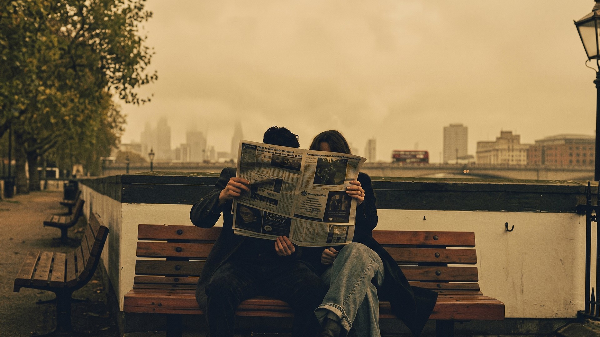
Overcast days are better than people think. Flat grey light is unflattering for landscapes but excellent for street scenes, markets, architecture details, and anything with color. The light is even, nothing blows out, and colors read accurately.
Blue hour is underused. The twenty minutes after sunset, when the sky is still deep blue but city lights are on, gives you both. Full dark loses the sky entirely.
Include something for scale
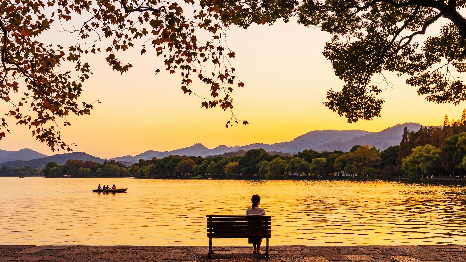
The most common failure in landscape and architecture photos is that nothing indicates size. A mountain photographed alone could be a hill. A cathedral interior could be a chapel.
Put a person, a car, a doorway, or a bench in the frame. It doesn't need to be the subject; it just needs to be recognizable enough that the viewer's brain can calibrate against it.
This is why travel photos with a person in them almost always work better than the same view without.
Get the foreground to do something
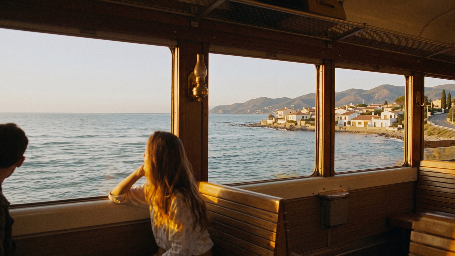
A photo of a view is usually flat. A photo of a view from somewhere has depth.
Shoot through a doorway, over a railing, past a tree branch, between two buildings. Including something close to the camera creates layers, and layers read as three-dimensional.
This also solves the problem of the boring bottom third of the frame, which in most landscape photos is empty ground.
Photograph details, not just views
The wide shot of a famous place has been taken a million times and yours won't be better. What makes a travel set feel like a place is the specific stuff.
Signage and typography. Fonts and language are strong location markers.
Food as it's actually served. Not styled, just on the table in front of you.
Textures and surfaces. Tile, peeling paint, cobbles, market produce.
How people use space. Someone sitting on a step, a queue, a conversation.
A set of fifteen details communicates a place better than five wide shots of landmarks.
Composition, minimally
Two habits cover most situations.
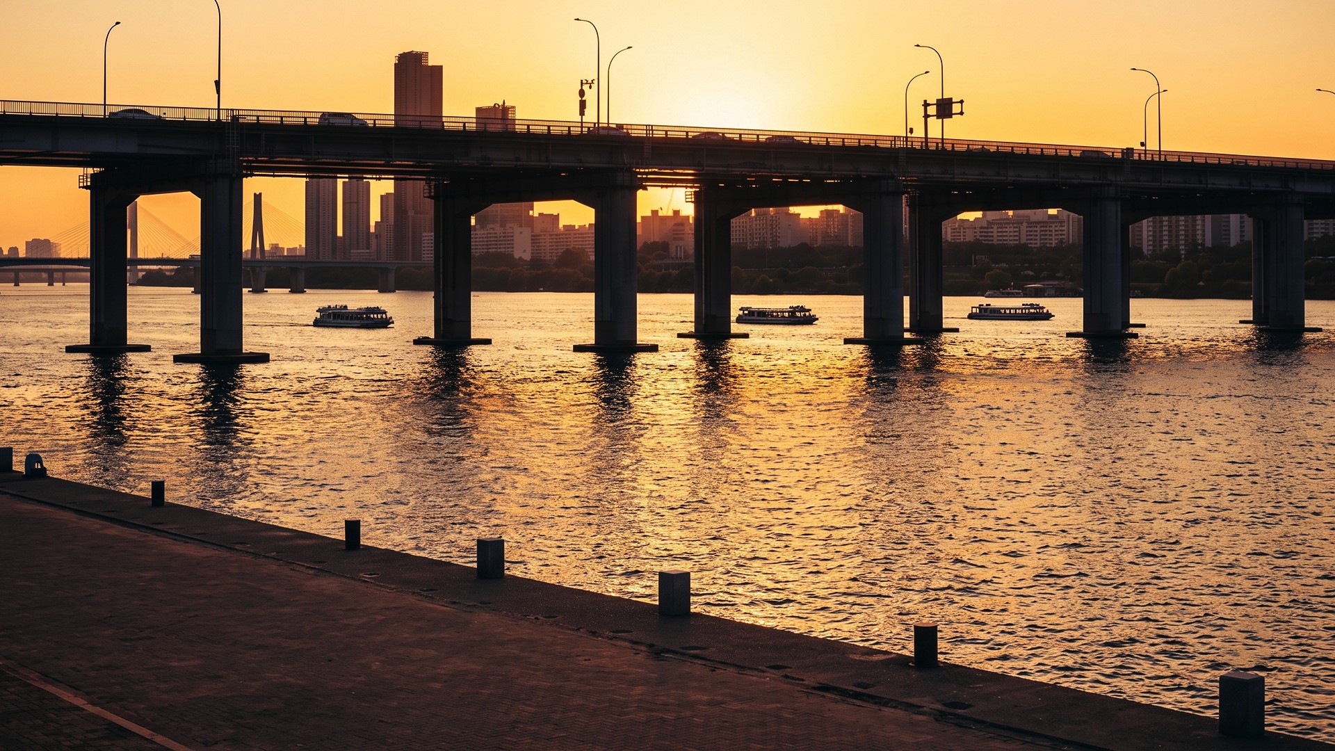
Put the horizon somewhere other than the middle. Sky interesting? Horizon low. Ground or water interesting? Horizon high. Dead center only works when the scene is genuinely symmetrical.
Leave space in the direction of movement. If someone is walking left, give them room on the left. A subject pressed against the edge they're heading toward feels cramped.
Filters that suit travel
Travel covers a lot of different conditions, so no single filter works throughout. But a few directions help.
Consistency matters more than perfection. A set of photos processed the same way reads as a body of work. Fifteen photos each with a different filter reads as a phone gallery. Pick two or three and stay with them for the trip.
Warm for golden hour, neutral for overcast. Pushing warmth on an already-warm scene tips into orange. On a grey day, a warm filter is what rescues the photo.
Consider location-specific sets. Retrica's Tokyo set (SAKURA, UMI, MOMIJI, UKI) leans bright and high-saturation with a warm white balance shift, which suits clear-sky urban daytime. Island (CAPRI, CORSICA, STRN) suits coast and water. Wanderlust (DRIFT, ECHO, GAZE, FLUTTER, AMBLE) is built around travel scenes generally.
For street and architecture, try lower saturation. Cities photograph well with muted color, because the interest is in form and texture rather than hue. Retrica's Flat Color Series and Chic sets both go this direction.
Black and white saves difficult light. Harsh midday sun, mixed artificial lighting, an unflattering color cast: converting to monochrome removes the problem entirely and often improves the photo.
Practical things
Shoot more than feels reasonable. Storage is cheap and you can't come back. Take the shot you're unsure about.
Take the same scene twice: wide and tight. You won't know which one you want until later.
Charge and back up daily. The most common travel photo disaster isn't a bad photo, it's a dead phone at the right moment or a lost device with everything on it.
Put the phone away sometimes. This sounds like a platitude but it's practical advice: photos of a place you actually looked at are better than photos of a place you only saw through a screen.
The short version
Shoot early or late, not midday
Put something in frame that shows scale
Include a foreground element for depth
Take more details than wide shots
Pick two or three filters and use them throughout
Techniques described here apply to any phone camera.


