Clarity
Clarity enhances midtone contrast to add depth and texture to your image. It gives photos a more three-dimensional, punchy feel, but applying it heavily on portraits can accentuate skin texture and imperfections.
Depth You Can Feel

Clarity works in the midtones — the tonal range between the brightest highlights and the deepest shadows — and increases local contrast within that zone to give photos a sense of weight, texture, and dimension that feels physical rather than purely visual. Unlike sharpness, which targets the fine edges and outlines of individual elements, clarity affects the broader mid-level structure of the image, making the overall composition feel more three-dimensional, grounded, and present. Think of it as the difference between outlining a drawing and adding shading — sharpness defines the edges, while clarity fills in the volume between them. It's the adjustment that takes a photo from looking like a flat record of a scene to feeling like an actual place you could step into, and it's particularly effective in any image where depth, atmosphere, and physical presence are central to the story being told.
A Powerful Tool for Landscapes and Texture
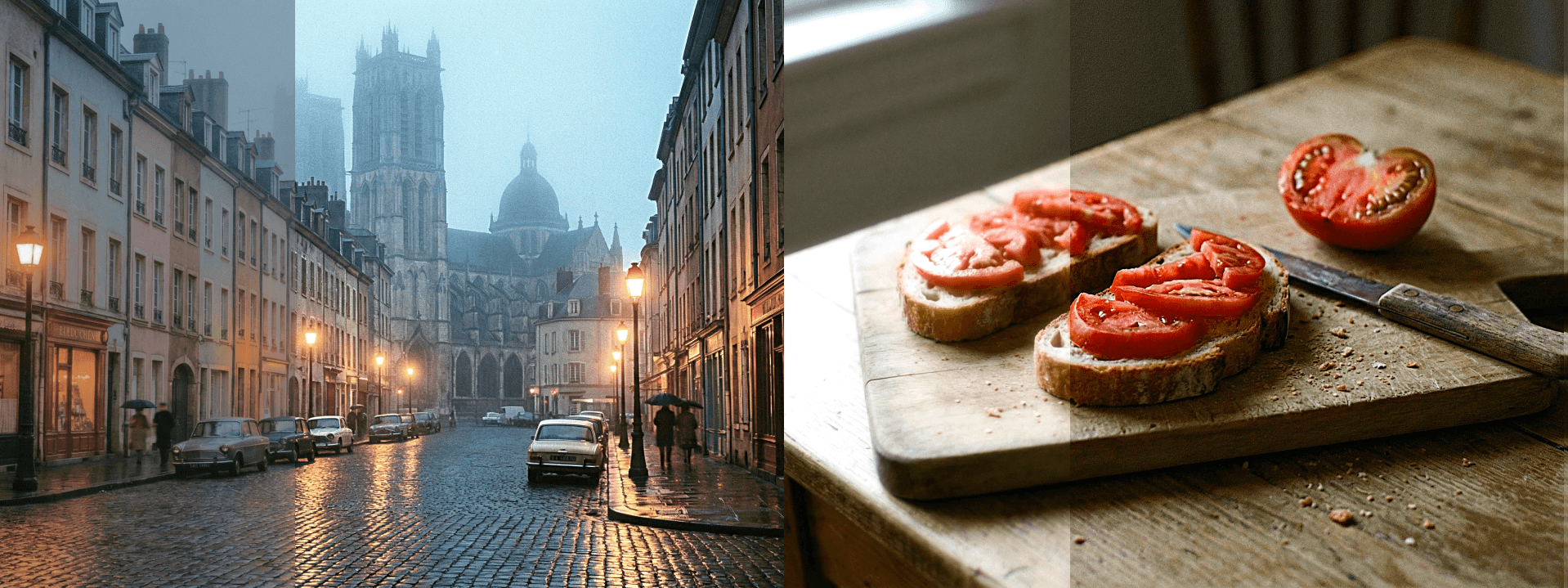
Clarity excels in images where texture is the primary subject or where the physical quality of a surface is essential to the emotional impact of the photo. Rocky terrain, dramatic cloudscapes, weathered wood, cracked concrete, aged brick, rolling fog over mountain ranges, or the layered complexity of a dense urban skyline — in each of these contexts, pushing clarity adds a tactile richness that makes the viewer feel like they're standing inside the frame rather than looking at a photograph of it. The effect is particularly compelling in black and white photography, where the absence of color means texture and tonal contrast carry the entire visual weight of the image, and clarity can dramatically elevate the sense of drama and depth. It also works exceptionally well in food photography, where the goal is to make every ingredient look as vivid, textured, and real as possible — glistening sauces, caramelized edges, and the rough surface of freshly baked bread all respond beautifully to a careful clarity boost.
Keep It Away From Skin
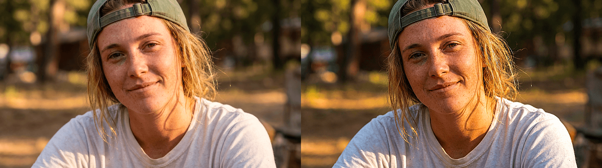
Clarity's greatest weakness is portraiture, and it's a weakness worth understanding clearly before reaching for the slider. Because clarity amplifies midtone contrast across the entire image without distinguishing between subjects, it has a powerful tendency to accentuate every pore, fine line, texture, and imperfection on skin — often in ways that feel unflattering and clinical rather than detailed and refined. A very small amount can add a subtle, healthy definition to a face, lending it a sense of three-dimensionality that makes the subject look more present and alive in the frame. But even a modest increase beyond that threshold quickly becomes counterproductive, particularly under harsh light or with high-resolution cameras where skin texture is already highly visible. When editing portraits, the better approach is to reach for vibrance to lift color energy, soft light to add warmth and glow, or targeted adjustments that affect specific areas rather than the image as a whole. Reserve clarity for the background, clothing, or environmental elements — and keep it well away from faces unless the intent is deliberately raw and unretouched.