Vibrance
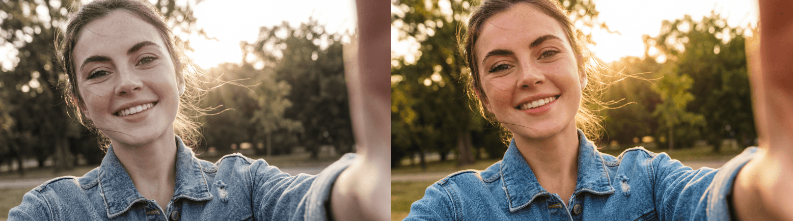
Vibrance selectively intensifies muted and softer colors while protecting already-saturated tones. It's a smarter alternative to saturation for natural-looking results, especially on skin tones, where it avoids the orange, oversaturated look.
Smart Saturation
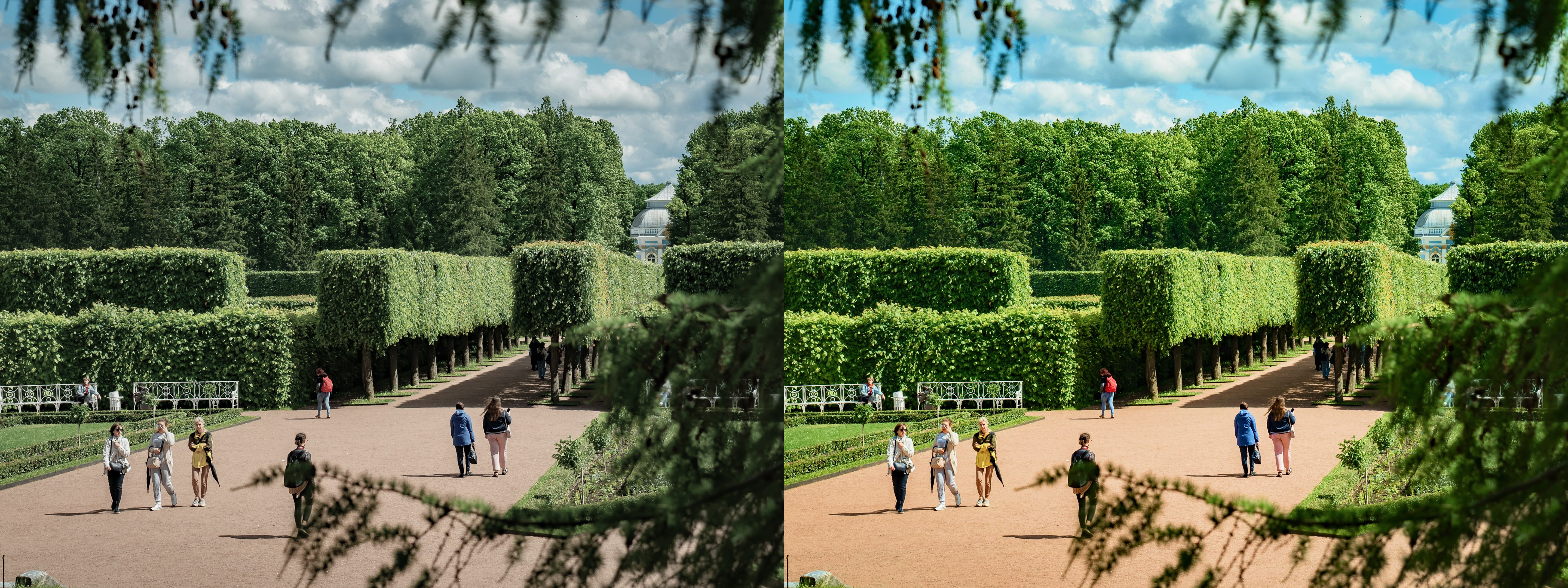
Vibrance is saturation with intelligence built in — a more sophisticated approach to color intensity that considers the existing state of each color in the image before deciding how much to amplify it. Rather than boosting every color by the same flat amount the way global saturation does, vibrance uses an algorithm that identifies which colors in your photo are already rich and leaves them largely untouched, while selectively and proportionally intensifying the softer, more muted, and more desaturated tones that genuinely need the most help. The result is a more balanced, natural-looking, and emotionally resonant color enhancement that avoids the most common pitfalls of blunt saturation — muddy midtones, oversaturated skies, and the unnatural skin tones that make portraits look processed rather than photographed.
The Portrait Photographer's Best Friend
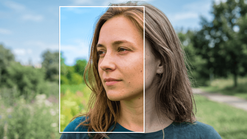
Vibrance was designed with skin tones specifically in mind, and this protective quality is what makes it the preferred color tool for portrait photographers, content creators, and anyone working with images where human subjects are central to the composition. It's engineered to leave the warm, peachy, golden, and amber hues that skin tones typically occupy — the tonal range roughly between 10 and 40 on a standard hue wheel — largely protected from over-amplification, even as it enriches cooler and more neutral colors like sky blues, forest greens, and deep teals that sit further from the skin tone range. This means you can push vibrance significantly further than you would ever push saturation before the image starts to feel unnatural, making it an ideal first step in any portrait, wedding, lifestyle, or fashion edit where rich, expressive color and flattering skin tones need to coexist in the same frame.
Layer It With Saturation for Full Control
Vibrance and saturation produce the best results when used together as a layered system rather than as interchangeable alternatives. The most effective approach is to begin with vibrance, using it to raise the overall color energy of the image while its protective algorithm handles the tones that are most vulnerable to over-intensification. Once vibrance has established a balanced color foundation, saturation can be introduced in small, deliberate increments to push specific areas of the color palette that need a stronger boost — the deep greens of a forest, the warm reds of an autumn scene, or the vivid blues of a clear sky. This two-step method gives you significantly more nuanced and precise control over the final color palette than either tool can offer alone, and it's the approach most consistently used by professional colorists, photographers, and retouchers who need to deliver results that feel rich and intentional without crossing the line into oversaturation.