Tone Curve
Tone Curve gives you precise control over the brightness and contrast of specific tonal ranges in your photo. By adjusting the curve across shadows, midtones, and highlights independently, you can achieve highly nuanced and professional-grade color grading.
The Most Powerful Tool in the Room
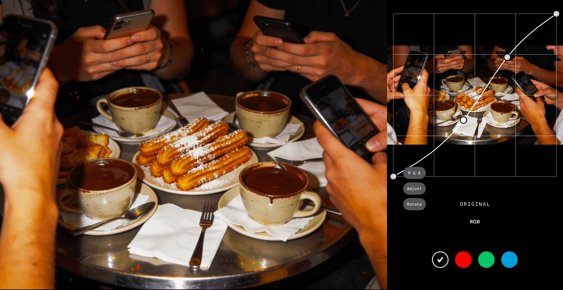
The tone curve is a graph that maps every tonal value in your photo — from pure black at the far left to pure white at the far right — and allows you to reshape the relationship between input and output tones by adding control points anywhere along the curve and dragging them upward to brighten or downward to darken. It sounds technical, and it is — but what it offers in return for that complexity is something no other tool in photo editing can fully replicate: simultaneous, layered, and extraordinarily nuanced control over brightness, contrast, and color across every part of the tonal range independently and at once. Where the exposure slider moves everything uniformly and the highlights and shadows sliders work within predefined tonal bands, the tone curve allows you to define exactly which tonal range you want to affect, how much you want to affect it, and how gradually the adjustment transitions into the tonal ranges on either side of it. It is, by most professional standards, the single most powerful adjustment tool in photo editing.
Shaping Light With Precision
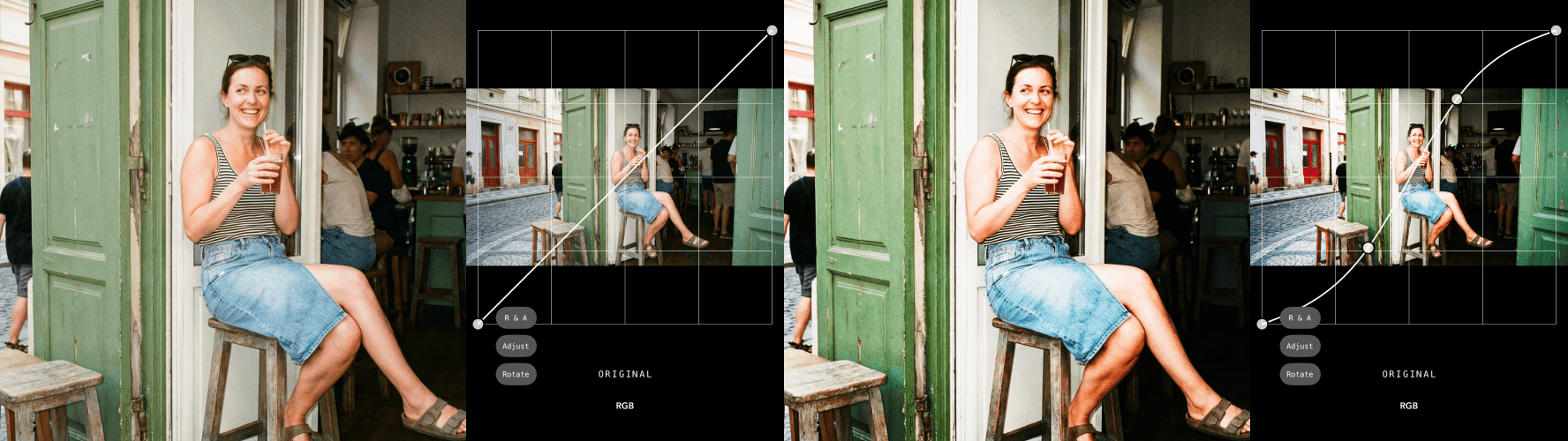
The classic S-curve — created by anchoring a point in the lower shadows and pulling it slightly downward while simultaneously anchoring a point in the upper highlights and pulling it slightly upward — is one of the most fundamental and widely used techniques in photo editing, and for good reason: it simultaneously deepens shadows, brightens highlights, and increases the overall contrast of the image in a way that feels more organic and less aggressive than simply boosting the contrast slider. The beauty of the S-curve is in its flexibility — the steeper the curve in the midtone region, the more contrast is added; the gentler the S, the softer and more subtle the effect. Flattening the curve in the opposite direction reduces contrast for a softer, more muted, film-inspired look. Pulling just the midpoint upward brightens the image with a nuance and precision that a simple exposure slider cannot achieve. And because every adjustment on the curve is continuous rather than stepped, the tonal transitions it produces feel smooth, natural, and optically convincing in a way that preset adjustments rarely can.
Where Style Becomes Signature
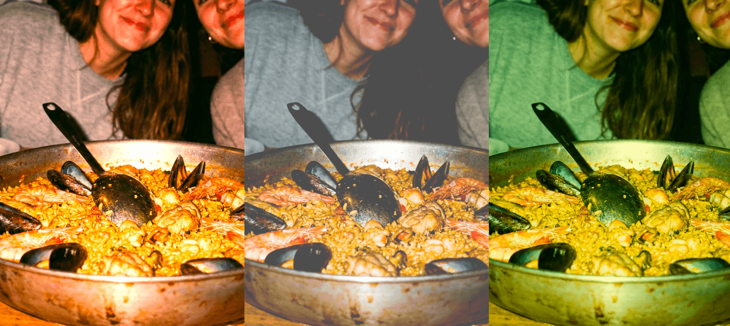
Beyond luminance and contrast, the tone curve can be applied independently to the individual red, green, and blue color channels of an image, opening up a level of color grading sophistication that few other tools can approach. This is where the tone curve transitions from a technical correction tool into a genuine creative instrument — one capable of producing the kind of nuanced, deeply personal color work that defines a photographer's visual identity and makes their images instantly recognizable. Lifting the red channel in the shadow region creates warm, amber-tinted shadow tones that evoke the look of specific analog film stocks. Adding a slight blue curve to the highlights introduces a cool, silver-tinted luminance that feels clinical, modern, and cinematic. Pulling green out of the midtones while adding it back into the shadows creates a split-toned look with a distinctive color separation between lights and darks. These subtle, layered color curve adjustments are the techniques most consistently used by professional colorists and photographers to create the cohesive, signature visual styles that set their work apart — and learning to use them with intention and precision is one of the most meaningful investments any serious photo editor can make.