Contrast
Contrast controls the difference between the light and dark areas of your photo, making tones either more distinct or more uniform. Increasing it gives images a bold, punchy look with deeper blacks and brighter highlights, while reducing it creates a flat, muted, or faded aesthetic.
The Difference Between Flat and Alive
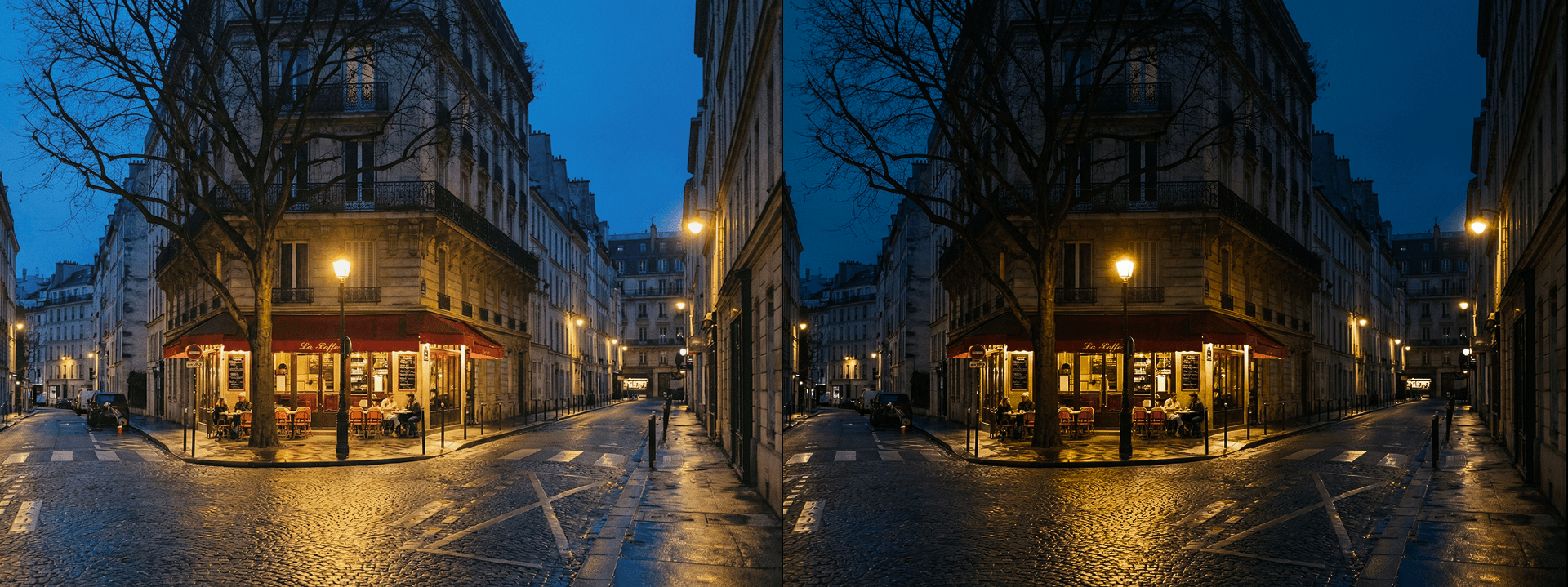
Contrast is the distance between your photo's lightest lights and darkest darks — and adjusting it changes not just the look of an image, but its entire energy and emotional register. A high-contrast photo feels bold, dramatic, and immediate, with a visual tension that commands attention and gives every element in the frame a sense of weight and presence. A low-contrast photo feels soft, hazy, and nostalgic — closer to a memory than a record, with a quieter, more introspective quality that invites the viewer to linger rather than react. Understanding how to use contrast intentionally is one of the most fundamental skills in photo editing, because it defines the mood of an image before color, sharpness, or any other adjustment has a chance to contribute.
Punchy or Faded — You Decide
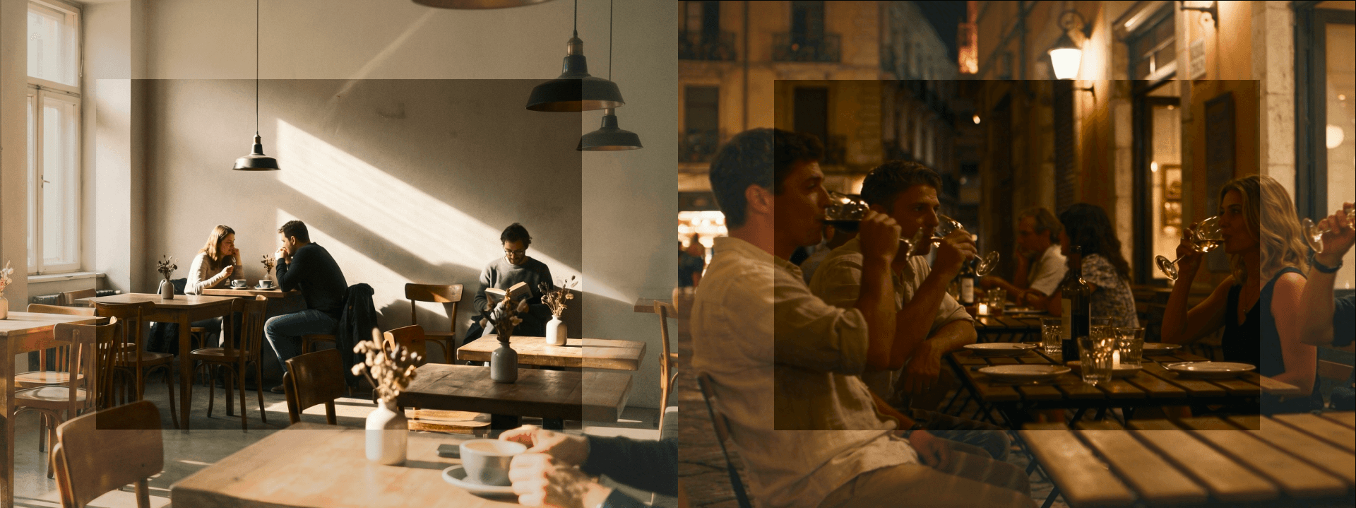
Boosting contrast deepens shadows, brightens highlights, and gives images a punchy, three-dimensional quality that makes subjects feel like they're physically separating from their backgrounds. This works especially well for architecture, where hard lines and geometric forms benefit from strong tonal separation, urban street photography where gritty realism and visual drama are the point, and dramatic landscapes where you want skies to feel heavy and foregrounds to feel grounded. Reducing contrast does the opposite — it compresses the tonal range, softening the relationship between light and dark and creating a muted, film-like quality that feels intentionally understated. This lower-contrast approach has become a defining characteristic of contemporary editorial, portrait, and lifestyle photography, where the goal is mood and intimacy rather than impact and immediacy. Both directions are equally valid — the right choice depends entirely on what the image is trying to say.
The Backbone of Your Edit
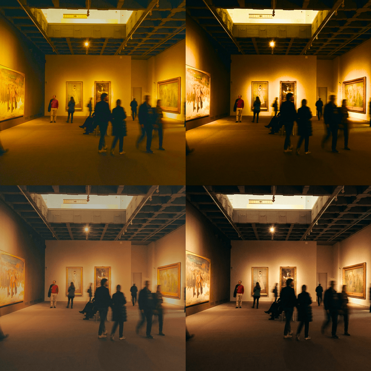
Contrast is rarely something to set and forget — it's a foundational decision that actively shapes how every other adjustment in your edit behaves and feels. Saturation added to a low-contrast image produces soft, muted color that feels painterly and atmospheric. The same saturation applied to a high-contrast image produces vivid, punchy color that feels graphic and immediate. Sharpness, clarity, and even white balance all read differently depending on the contrast level you've established first. This is why experienced editors typically set contrast early in the editing process — not necessarily as a final value, but as a working foundation that gives every subsequent adjustment a consistent tonal environment to operate within. Getting contrast right early doesn't just improve the image — it makes the entire editing process more intuitive, more predictable, and significantly more efficient.