White Balance
White Balance adjusts the overall color temperature of your photo to make it appear warmer or cooler. Shifting it toward warm tones adds a golden, cozy feel, while cooler settings create a crisp, clean, or cinematic atmosphere.
Color Temperature Is Mood
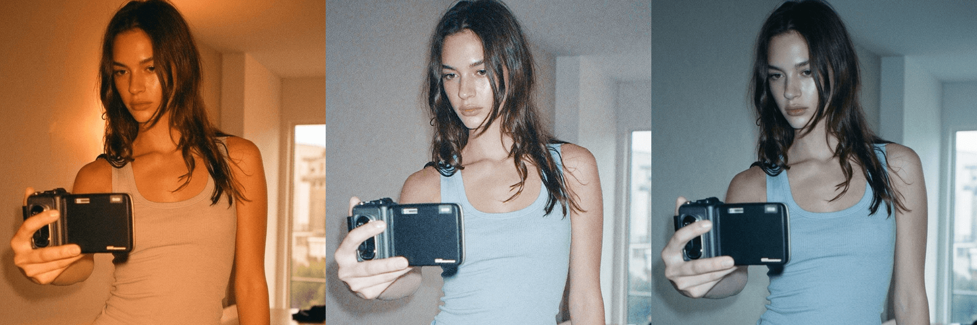
White balance controls the color temperature of your photo — how warm or cool the light appears across the entire image — and it's one of the adjustments that has the most immediate and instinctive impact on how a photo feels to look at. It's rooted in a technical need: different light sources emit light at measurably different temperatures, measured in Kelvin, and white balance corrects for those differences so that whites appear white and colors appear as the eye perceives them in real life. Candlelight sits at around 1800K, casting deep orange warmth. Midday sunlight sits around 5500K, producing neutral, balanced light. Overcast skies push toward 7000K and above, introducing the cool, bluish cast that makes shadowed outdoor scenes feel flat and cold. In creative editing, however, white balance becomes something far more expressive than a technical correction — it's a tool for shaping the emotional atmosphere of an image before a viewer can consciously explain why they feel the way they do looking at it.
Warm Draws In, Cool Pulls Back
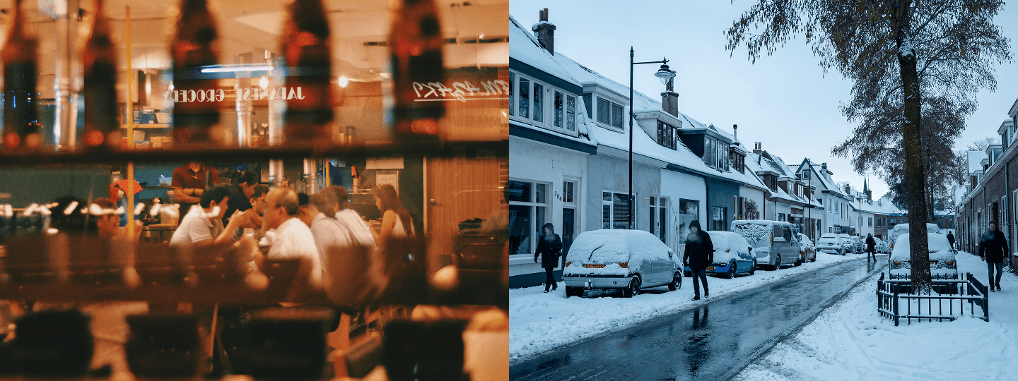
Shifting white balance toward warmer tones introduces golden, amber, and honey hues that feel intimate, nostalgic, and deeply inviting — the visual equivalent of a room lit by late afternoon sun or the glow of a candle. This warmth signals safety, comfort, and familiarity to the viewer on an almost instinctive level, which is why it works so powerfully in lifestyle content, portraits shot in natural or warm artificial light, food photography where appetite appeal is everything, and any scene where the goal is to make the viewer feel welcome and at ease inside the frame. Cooler white balance does the opposite — it introduces blue, cyan, and silver tones that feel crisp, precise, and emotionally distanced. This cooler register works well for architectural photography where clean lines and rational geometry are the subject, editorial and fashion work where a more clinical aesthetic serves the concept, tech and product photography where neutrality signals objectivity, and any winter or nighttime scene where the cold itself is part of the story.
Start With Accuracy, Then Create
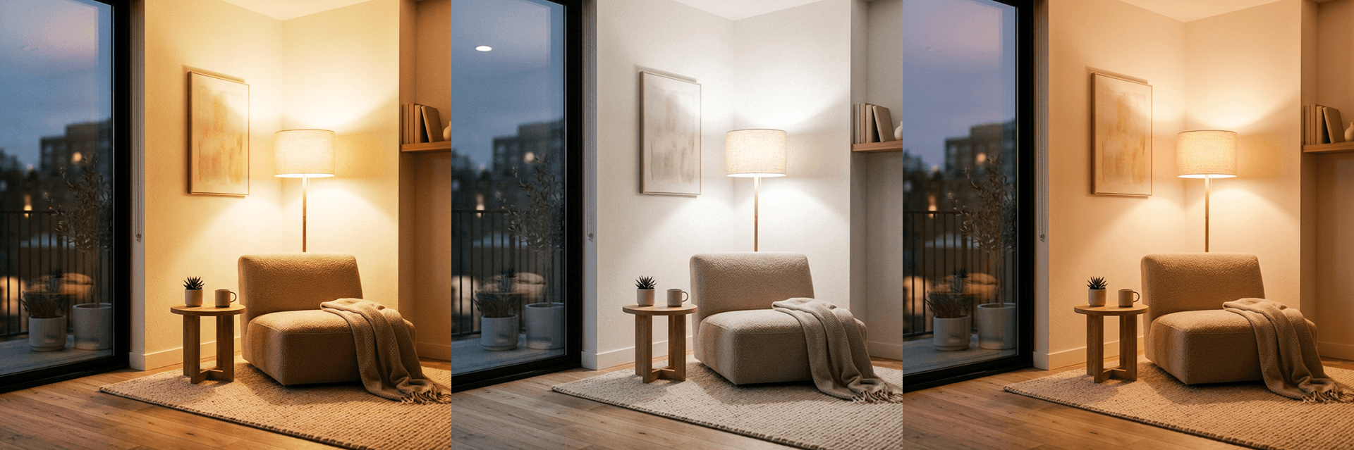
Before using white balance as a creative tool, it almost always helps to establish a neutral baseline first — correcting for any unwanted color casts introduced by artificial lighting, mixed light sources, or the particular color temperature of the shooting environment. Indoor tungsten lighting pulls images orange. Fluorescent lighting introduces an unpleasant green cast. Shooting in open shade on a clear day creates a cool, bluish tone that can make skin look sallow and unnatural. Neutralizing these casts before making any creative decisions gives you a clean, accurate starting point from which intentional shifts in either direction feel controlled and deliberate rather than compensatory. Once the image looks natural and balanced, you can move the temperature slider with confidence — knowing that any warmth or coolness you're adding is a creative choice rather than a correction. Getting white balance right early also has a compounding benefit: it makes every subsequent color-based adjustment, including saturation, HSL, and tone curve, significantly more predictable and easier to control, because all of those tools are responding to color information that's already been properly established rather than working around a cast that was never fully resolved.