Halftone
Halftone overlays a pattern of dots or shapes onto your photo to replicate the look of classic print or comic book aesthetics. It adds a bold, graphic quality to images, but can overpower detail and works best as a stylistic accent rather than a heavy effect.
When Photography Meets Print
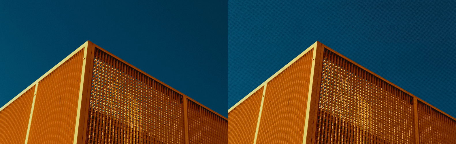
Halftone overlays a repeating pattern of dots, lines, or geometric shapes onto your image to simulate the visual language of classic offset printing, screen printing, and comic book reproduction — a printing technique that dates back to the mid-nineteenth century and that defined the visual aesthetic of mass-produced print media for well over a hundred years. Before digital printing made continuous-tone reproduction possible, all photographic images in newspapers, magazines, and books had to be broken down into patterns of small dots of varying size and spacing in order to be reproduced by a printing press — and those visible dot patterns became, over time, a distinctive and widely recognized aesthetic in their own right, closely associated with pop art, Dadaism, the Bauhaus movement, zine culture, and the graphic design traditions of the mid-twentieth century. In digital photo editing, halftone is used intentionally to reference and revive that aesthetic — to bring the visual language of print into a digital image in a way that feels simultaneously historical and contemporary.
Bold, Graphic, and Deliberately Imperfect
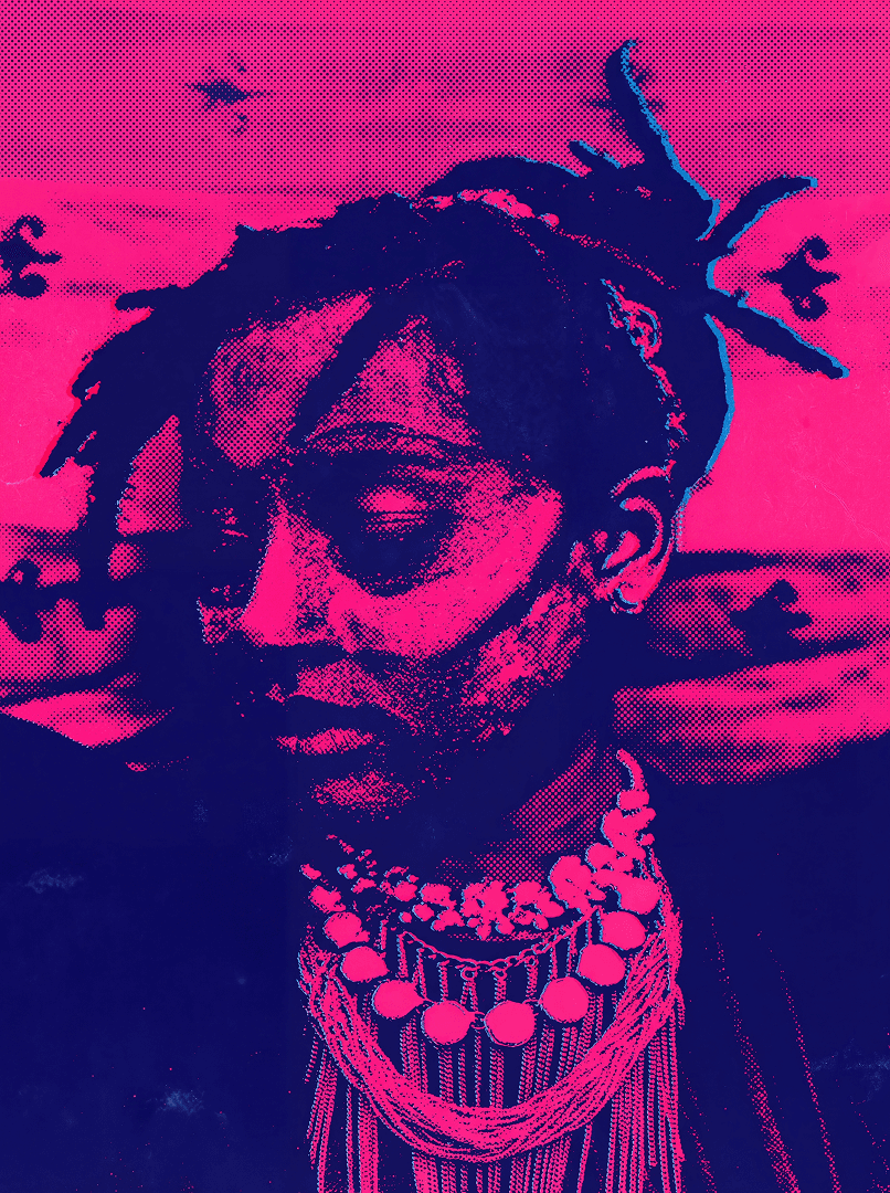
Halftone works most effectively when the creative goal is graphic impact, visual boldness, and a deliberately constructed aesthetic rather than photographic realism or technical precision. It transforms photographs into something that sits closer to illustration or graphic design — reducing the tonal complexity and continuous gradients of a photographic image and replacing them with a structured, patterned, and inherently two-dimensional visual language that feels deliberately made rather than mechanically captured. This transformation is particularly compelling for editorial graphics, where the halftone pattern adds a layer of visual texture and historical reference that elevates the composition beyond straightforward photography. It also works well for poster-style compositions, social media content where visual distinctiveness and immediate recognition are paramount, album artwork, brand identity materials, and any creative context where the goal is to produce an image that reads more as a designed artifact than as a document of reality.
Use It as an Accent, Not a Default
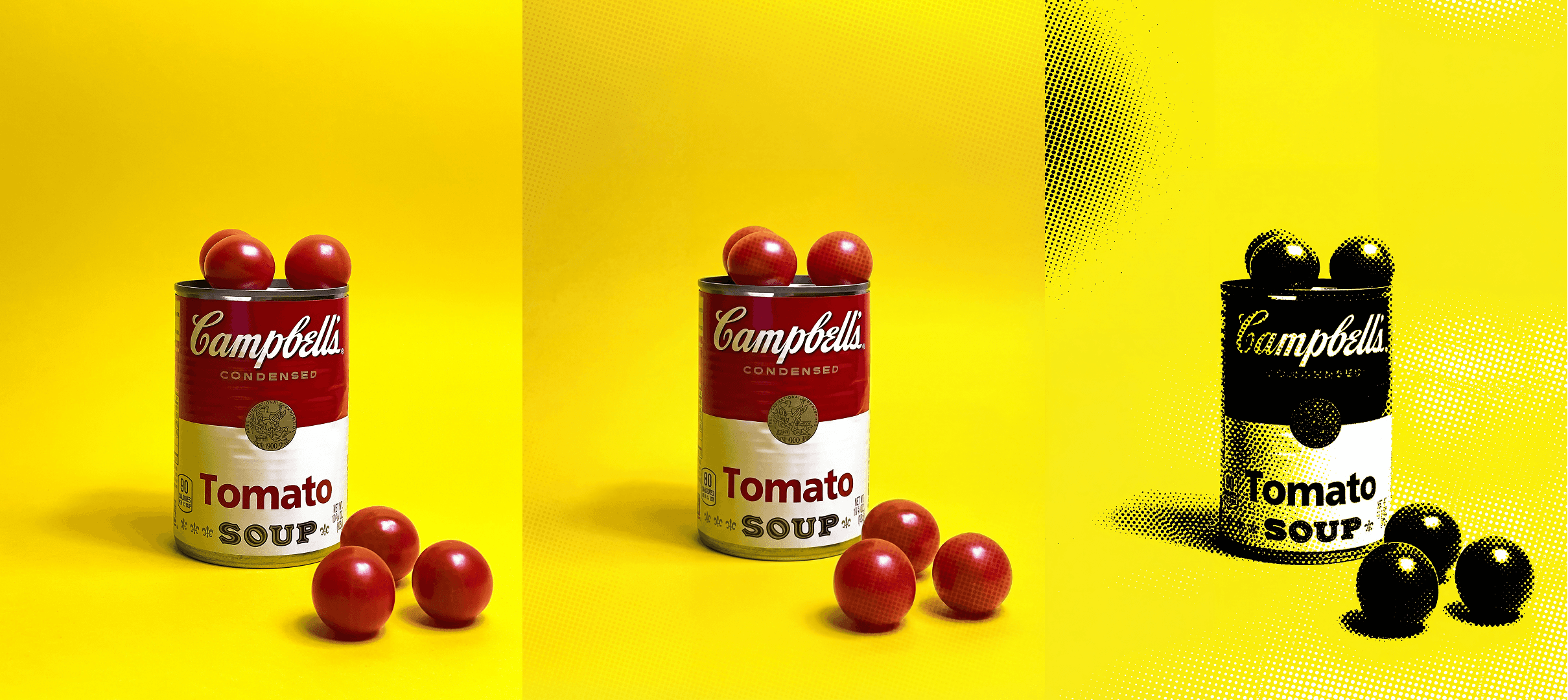
Because halftone is such a visually assertive and immediately recognizable effect, it carries a significant creative commitment — applying it to an image is a statement rather than a subtle enhancement, and it works best when that statement is backed by a clear and intentional creative rationale. The most common mistake with halftone is applying it too broadly, too heavily, or without sufficient consideration of whether the specific image and its content genuinely benefit from the treatment. Used selectively and with restraint — as a stylistic accent that defines a specific visual identity rather than a default filter applied indiscriminately — halftone can be an extraordinarily powerful creative tool that gives work an unmistakable graphic signature. Overused, it quickly becomes repetitive, visually exhausting, and loses the sense of deliberate creative intention that makes it compelling in the first place. At its very best, halftone feels like a considered design decision that transforms a photograph into something more conceptual, more graphic, and more intentionally authored than a purely documentary image could ever be.