Grain
Grain adds a film-like texture of fine noise across your photo for a vintage, analog aesthetic. It softens the overly clean look of digital photography, but too much can reduce perceived sharpness and obscure fine detail.
The Beauty of Imperfection

Grain adds a layer of fine, random, organically distributed texture across your image that mimics the physical noise of analog film photography — the visible silver halide crystals that gave film its characteristic texture and contributed so significantly to the emotional warmth that made film photography feel fundamentally different from its digital successor. In the digital age, where sensors produce images that are often technically flawless but emotionally sterile — too clean, too precise, too free of the imperfections that make a photograph feel like it was made by a human being rather than a machine — grain reintroduces a sense of physicality, materiality, and organic imperfection that many photographers and visual artists find far more emotionally resonant than technical perfection. It's not just a stylistic choice. For many creators, it's a philosophical one — a deliberate rejection of digital sterility in favor of images that feel lived in, tactile, and genuinely human.
Setting the Mood With Texture
Grain works across an exceptionally wide range of photographic styles and creative intentions, and the character of the grain you add — its size, intensity, and distribution — can be tuned to serve very different aesthetic goals. Fine, subtle grain adds a barely perceptible tactile quality to portraits and lifestyle photography that softens the clinical sharpness of digital capture without drawing attention to itself — the viewer feels the difference before they can identify it. Medium grain begins to assert itself more visibly, giving images a documentary, reportage, or editorial quality that feels grounded and real rather than polished and produced. Heavy, coarse grain transforms a photo more dramatically — it gives street photography a raw, urgent, almost confrontational energy, adds a lo-fi, analog character to color images that makes them feel decades older than they actually are, and can push black and white photography toward something that feels genuinely archival and historically resonant.
Grain Versus Noise — Know the Difference
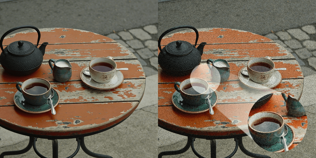
Grain and digital noise are frequently confused, and while they can produce superficially similar results, the difference between them is immediately apparent to a trained eye and has a profound impact on how an image feels. Film grain has a random, organic, luminance-based quality that distributes evenly across the image and integrates naturally with the underlying tones — it adds texture without disrupting color accuracy or creating the unpleasant chromatic artifacts that make digital noise so visually unpleasant. Digital noise, by contrast, tends to be more uniform in distribution, frequently introduces unwanted color shifts — particularly in shadow areas where red, green, and blue channels become unevenly distributed — and has a pattern that the human visual system reads as a flaw rather than a texture. When adding grain in editing, less is almost always more, and it's worth evaluating the result at the final intended output size, since grain that reads as subtle and elegant at full screen can become distracting and overwhelming when the image is viewed at a smaller scale or on a mobile device.