Saturation
Saturation controls the overall intensity of all colors in your photo simultaneously. Boosting it makes every color more vivid and eye-catching, but pushing it too far can result in unnatural, oversaturated tones across the entire image.
Color at Full Volume
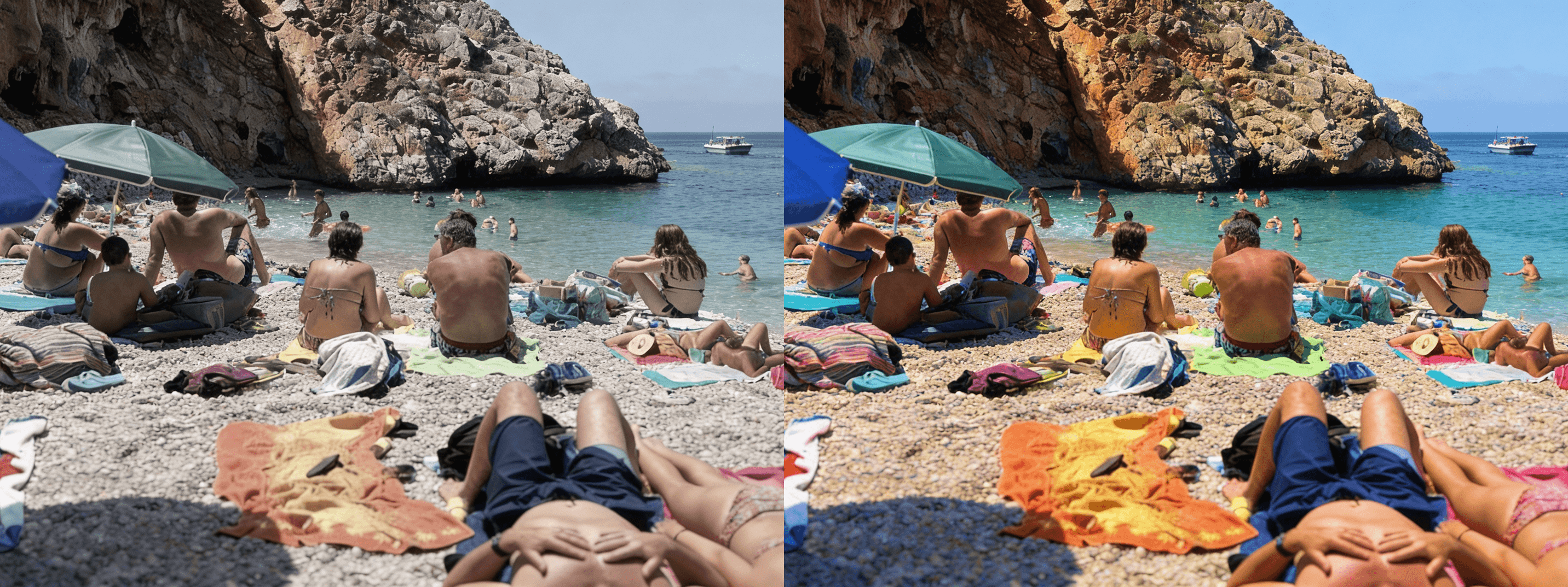
Saturation controls the intensity of every color in your photo simultaneously — reds, greens, blues, yellows, all of them at once, without distinction or selectivity. Think of it as a single master dial that either enriches or drains the color from your entire image in one move. At moderate levels, a saturation boost adds vibrancy, life, and visual energy to a photo, making colors feel more present and expressive than they appeared at the moment of capture. At its extremes, it either strips the image toward near-monochrome, draining warmth and identity from every tone, or pushes it into oversaturated territory where colors begin to feel artificial, aggressive, and visually exhausting. Understanding where saturation helps and where it harms is one of the most important distinctions a photo editor can develop.
When More Is More — and When It Isn't

A saturation boost works most effectively in images that already contain strong, distinct, well-separated colors — tropical landscapes where greens and blues compete for attention, colorful street markets where every surface is a different hue, bold graphic compositions where color itself is the primary subject, or autumn foliage photography where the natural palette is already rich and needs only a modest push to feel fully realized. In these contexts, saturation amplifies what's already present in the image, making it feel energetic, vivid, and immediate. In subtler, more muted scenes — overcast landscapes, minimalist interiors, candid portraits taken in mixed light — boosting saturation tends to introduce unnatural color shifts, muddy midtones, and an overall heaviness that makes the edit feel forced rather than felt. The rule of thumb is simple: if the colors in the original image are already interesting, saturation will make them more so. If they aren't, saturation will only make the problem more visible.
A Blunt Instrument — Use Vibrance First
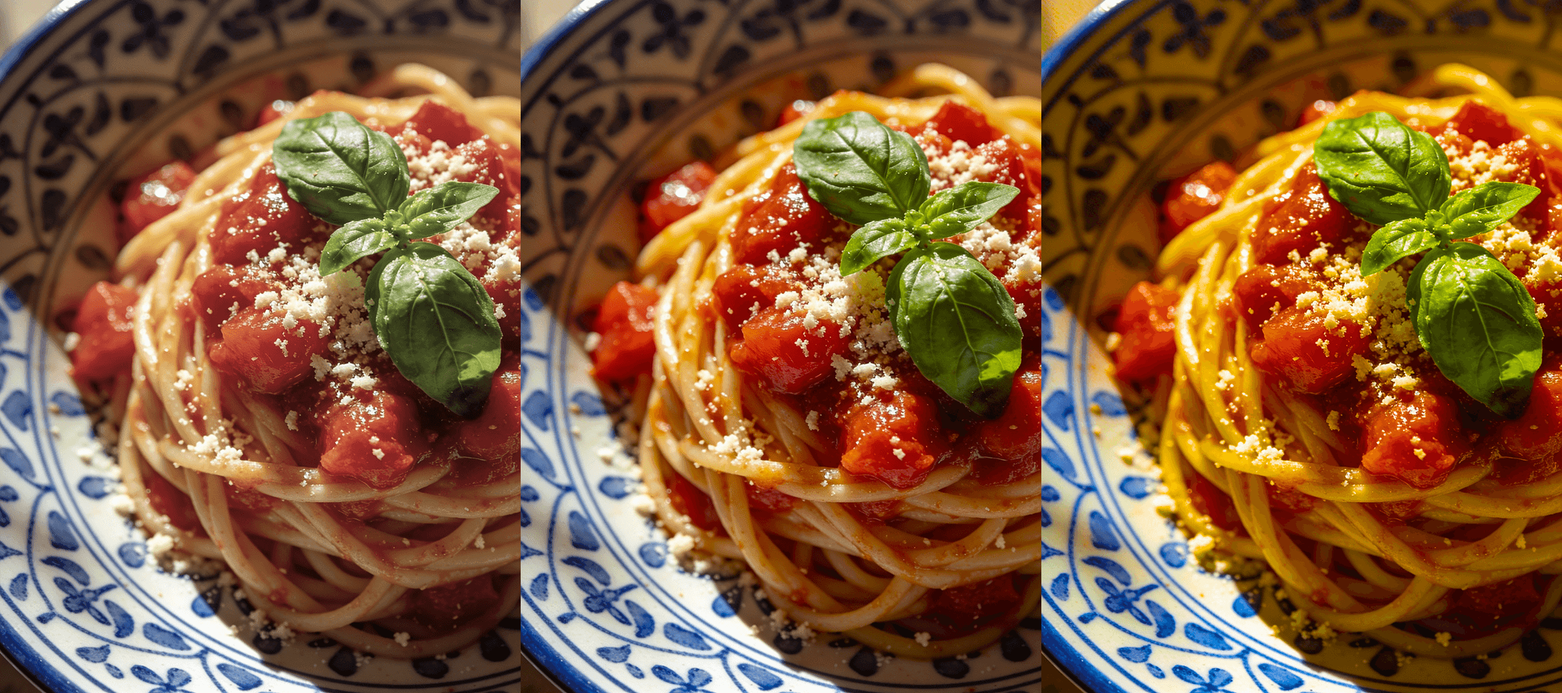
Because saturation treats every color in the image as equally in need of intensification, it has no mechanism for protecting the tones that are already working well or that are particularly vulnerable to over-amplification. Skin tones, which occupy a specific range of warm oranges and peachy yellows, are especially susceptible — even a modest saturation increase can push them into an unnatural, oversaturated territory that reads as sunburned, plastic, or simply wrong. For most editing situations, vibrance is a smarter and more controlled starting point, because it selectively boosts the colors that need help while leaving already-saturated and skin-adjacent tones largely untouched. Reserve saturation for fine-tuning specific color energy once the overall balance is already established, or for images where the subject matter is bold enough to absorb a global color push without any single tone becoming a problem. Used thoughtfully and in small increments, saturation is one of the most effective tools for making a photo feel fully alive — but used carelessly, it's also one of the fastest ways to make an edit look amateurish.